A big vision needs a voice just as loud as thunder
From day one, we have been adamant about our mission of democratizing investment in the MENA region. Our product has always meant to serve the purpose of breaking barriers and allowing access to investing for anyone & everyone. But most importantly, focusing on younger users, who unlike older generations are planning to not only secure their futures but planning to retire the 9-6 schedule as soon as… right now. Being a challenger brand that defies the status quo, we knew we needed to revisit our brand purpose & identity. We decided to hone in on the one aspirational space we’ve built Thndr for – to enable this generation & the coming one to achieve financial freedom.
Bringing our brand purpose to life. What does financial freedom look like?
Staying single-minded in our creative process, we worked with branding & design powerhouse The Nines Studio and agreed that if we were going to build a visual brand identity from scratch it needed to feel like a powerful enabler of financial freedom that spoke the language of our users. That means we needed to feel young, look bold, and sound relevant.
We explored different iterations of what financial freedom could look like for us, until we landed on the one icon that was the perfect visual expression of the empowering product were building in MENA.

The Thndr flag: The flag of financial freedom

And apart from the purposeful, carefully thought-out craft behind our icon (that only about 10 people in the world appreciate). For the rest of the world, it just looks pretty cool. And that’s enough for us.
Thndr, not thndr.
In our exploration of a new wordmark, we knew we wanted something sleek & simplified. We moved to uppercase T to signify a more determined tone. Knowing that our playful side will come to life through all other brand elements. Additionally, we revisited our main fonts, finding a pairing for both English & Arabic. A primary font that is angular, evoking a playful, approachable feel complemented by a body font that is modern, but still easy-to-read.

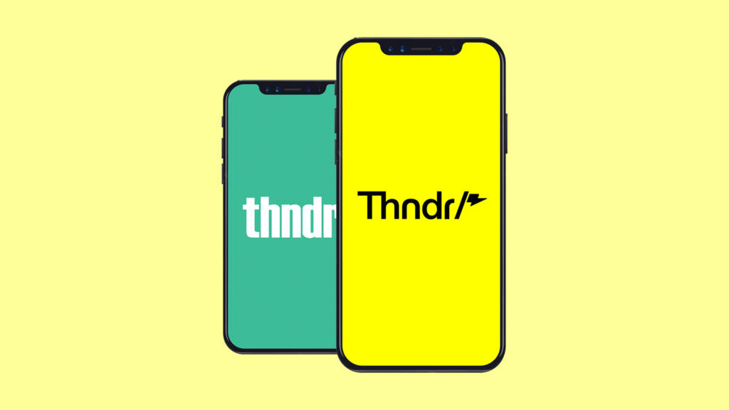
Bright striking yellow is the new green.
After thorough research and auditing of pretty much every single fin-tech & digital brand to ever exist; we knew green wasn’t for us anymore. In a nutshell, almost every player in our space opted for one of two colors – green to signify $$$ (cliché) & purple/blue for security/wealth (bigger cliché).
Our strategy was to be differentiated & appealing to young investors; and in the digital world, what’s more important is to stand out, and break through a sea of clutter. So, we landed on a bright yellow as our primary color – often completed by a powerful black. However, we were careful not to tie ourselves to only one color. Our palate now includes a variety of vibrant, fresh colors that are more reflective of the diversity of digital users.


A redesign reflected on our app.
Core to our rebrand was to ensure that our look & feel translated smoothly on our app. What was important here, is that our product experience was not changed, we only changed how we showed up.
Particularly on our app, is the introduction of our new isometric illustration style that is unique to our identity, complementing the more modern & youthful style we’ve adopted.

Ready to strike!
After months of work crafting our new identity, we feel this work is the truest form of what Thndr is & the essence of what our services offer to you. Most importantly, we know that our investors are young, empowered and bold. So, you deserve a brand & product that is equally young, empowered and bold.
We hope you love the new us. The new Thndr.
Financial freedom is the dream, and we’re right here to get you started.
شكل جديد متناغم وهي هي ثاندر
الحلم الكبير محتاج نغمة عالية زي نغمة ثاندر
من أول يوم كان فيه اصرار اننا نوفر فرص الاستثمار للجميع في الشرق الاوسط وشمال افريقيا. وثاندر كانت دايما هدفها محو أي مشكلة وتوفير كل حاجة المستثمر محتاجها عشان يقدر يبدأ رحلته الاستثمارية، تركزنا كان علي الشباب الصغير اللي بعكس الأجيال اللي قبل كده، الشباب اللي مش بس بيخطط يأمن مستقبله لكن بيفكر كمان في خطة للتقاعد في أقرب فرصة
دلوقتي وضعنا كشركة بتتحدي الأمر الواقع والنظام اللي المستثمرين متعودين عليه من سنين عرفنا اننا محتاجين نراجع أهداف الشركة وهويتها، وقررنا نهيأ ثاندر بكل طاقتها عشان نمكن الجيل ده من المستثمرين الشباب والجيل الجاي عشان يوصل للحرية المالية
يعني ايه حرية مالية؟ يعني حرية
في عملية التجديد لثاندر فكرنا كفريق واحد واشتغلنا مع شركة [The Nines Studio] واتفقنا علي اننا لو هنبني هوية جديدة لثاندر من الصفر فالهوية دي لازم تدي احساس قوي للمستخدمين للوصول للحرية المالية من خلال اللغة اللي بنستخدمها والألوان اللي بتعبر عننا وعن طموحاتنا وأهدافنا كثاندر وكأجيال جديدة بتستثمر بشكل مختلف. وده معناه اننا كنا عايزين نوصل احساس الشباب للمستخدم ويكون جرئ ومناسب
في محاولتنا للوصول لشكل بيعبر عن الحرية المالية اكتشفنا طرق كتير مختلفة لحد ما وصلنا لشكل الأيقونة اللي بتعبر عن ثاندر وأهدافها بشكل مثالي، بتصميمها وألوانها أيقونة ثاندر بقت بتعكس رؤية الشركة وهدفها في تمكين المستثمرين في الشرق الاوسط وشمال افريقيا
أيقونة ثاندر: أيقونة الحرية المالية
من التفكير في الأهداف والأفكار اللي خرجت لنا أيقونة ثاندر بالشكل والتصميم ده نقدر نقول ان 10 أشخاص بس في العالم فاهمينها وبالنسبة للباقي هيشوفوا شكلها حلو ولذيذ وده بالنسبة لنا كفاية
thndr مش Thndr
واحنا بنفكر في شكل وفونت كلمة ثاندر الجديدة عرفنا اننا محتاجين الكلمة يكون شكلها بسيط وفي نفس الوقت شيك. بدأنا بحرف T كابيتال للدلالة علي اننا محددين احنا عايزين ايه وعارفين احنا رايحين فين وطبعا عنصر المتعة اللي بيدي احساس بالحياة وبالشباب كان لازم يبقي موجود في باقي عناصر الشكل والتصميم الجديد
بالاضافة لده راجعنا شكل وأنماط الحروف ووصلنا لفونتين عربي وانجليزي. الفونت الأساسي واللي هتحسه بيكتب بزاوية ميل بسيطة بتدي احساس بالمرح بيكمله الفونت التاني الحديث والاتنين سهلين في القراءة
الأصفر اللامع هو الأخضر الجديد
عملنا الأبحاث والمراجعات اللازمة عن معظم العلامات العلامات التجارية الموجودة والمهتمة بعالم المال والأعمال واكتشفنا ان اللون الأخضر مش بتاعنا، باختصار معظم العلامات التجارية في تصميماتها اعتمدت علي لونين الأخضر وده طبعا لانه بيعبر عن الدولار والأزرق أو البنفسجي عشان يعبر عن الأمان والثروة “كليشيهات متكررة”
وكون اننا بندور علي حاجة مميزة تشد المستثمرين الشباب وفي ظل عالم الديجيتال اللي مليان تكرار كان مهم اننا نتميز فيه عن باقي الأشكال والتصميمات الموجودة في عالم المال والأعمال ووصلنا لان اللون الأصفر اللامع هيكون اللون المعبر عن أهداف ورؤية ثاندر بيكمله اللون الأسود اللي بيمثل القوة وبيظهر صفات ومميزات في اللون التاني “الأصفر اللامع”. وبالرغم من وصولنا للنتيجة الممتازة دي الا اننا قررنا ننوع وقدرنا نستخدم مجموعة ألوان مختلفة ومتنوعة نابضة بالحياة وبتعكس التنوع اللي بنهدف للوصول له مع كافة المستثمرين الشباب
شكل جديد لتطبيق ثاندر
واحنا بنشتغل علي شكل وأيقونة ثاندر الجديدة أهم حاجة كانت ازاي هنعكس ده علي التطبيق بحيث ميأثرش علي طريقة استخدامك لتطبيق ثاندر واننا محتاجين نغير الشكل بس
ولأن تطبيق ثاندر بالتحديد هو العنوان لهويتنا المميزة وشكلنا الجديد كان لازم يكمل باسلوبنا الشبابي الحديث اللي قررنا نمشي فيه
استعد للاستثمار
بعد شهور من التفكير والعمل علي تجديد شكل وهوية ثاندر وصلنا أخيرا لاحساس ان هو ده الشكل الحقيقي لثاندر وللخدمات اللي ممكن يقدمهالك. والأهم اننا عارفين ان المستثمرين بتوعنا من الشباب القوي واللي عندهم جرأة يستح اننا نوفرله منتج وخدمات تعكس القوة والجرأة وروح الشباب الموجودة فيه
نتمني تكونوا حبيتوا شكلنا الجديد، شكل ثاندر الجديد
حريتك المالية هي حلم واحنا هنا عشان نوصلك لحلمك